
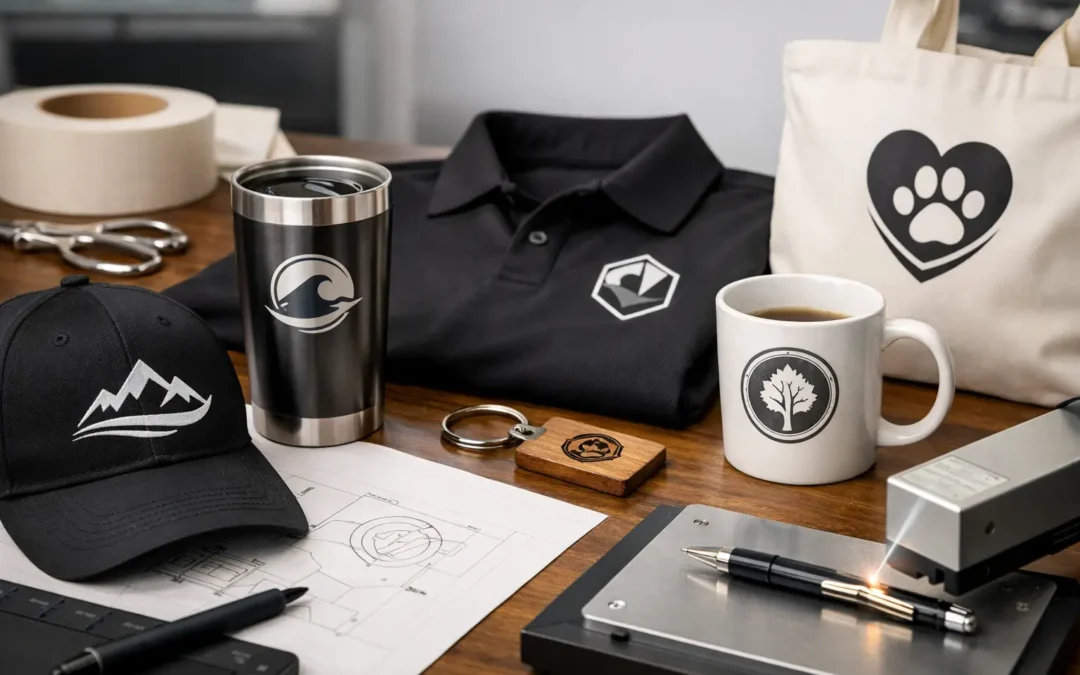
A logo that looks sharp on a business card can fail completely on a stubby cooler, beer glass or event banner. Fine detail may fill in, thin lines can disappear and colours can shift when the supplied file is not suited to the branding method. Knowing how to prepare logo artwork before production protects your brand presentation, avoids unnecessary delays and helps keep a bulk order on schedule.
For promotional products, artwork is not simply a file attachment. It is production information. The cleaner and more accurate the file, the more confidently a supplier can print, laser etch, embroider or apply your branding across hundreds or thousands of items.
Start with the original logo file
The best artwork usually comes from the original designer or brand agency, rather than from a logo copied out of a PDF, website or social media image. Ask for the master logo files in vector format, ideally AI, EPS or editable PDF. These files are made from mathematical paths rather than pixels, so they can be enlarged or reduced without becoming blurry.
A high-resolution PNG may be suitable for some full-colour print applications, particularly where a transparent background is needed. However, it is not a replacement for vector artwork. A JPEG is generally the least flexible option because it can introduce a coloured background, compression marks and soft edges.
If your business has brand guidelines, provide them with the artwork. They help confirm approved logo versions, colour references, clear-space rules and any restrictions on using the logo over dark or coloured product surfaces. This is particularly useful when several departments, venues or franchise locations are ordering under the same brand.
Use vector artwork where possible
Vector files give production teams the cleanest starting point for one-colour printing, spot-colour screen printing, pad printing, vinyl application and laser etching layouts. They also make it easier to separate individual colours correctly and assess whether fine detail will reproduce at the required size.
A vector PDF is not always truly vector. Some PDFs contain a low-resolution image placed inside a document. If you zoom in and the edges become visibly blocky or fuzzy, it is likely raster artwork. Sending the original AI or EPS file alongside the PDF removes that uncertainty.
Where text appears in a logo, convert fonts to outlines before supplying the final production file. This turns letters into shapes, so the logo will not change if the production computer does not have your chosen typeface installed. Keep an editable version separately for your own records, as outlined text cannot be easily edited later.
Prepare logo artwork for the product and branding method
The right file is only part of the job. Your logo also needs to work at the actual decoration size and on the chosen product material. A full-colour design printed on a large event backdrop has very different requirements from a single-colour logo on a pen, glassware or bottle opener.
For smaller products, simplify where necessary. A detailed crest, tiny tagline or intricate illustration may be clear on a large carton but unreadable on the side of a coffee cup. In these cases, a secondary logo lock-up or icon-only version can produce a much stronger result. It is better to use a simpler approved mark than force detail into a space that cannot support it.
Laser etching is a good example. It creates a refined, durable mark on suitable metal, timber and coated drinkware, but it does not reproduce colour gradients. The final appearance can vary according to the substrate, coating and etching area. A bold, single-colour logo with adequate line weight generally gives the best outcome.
Screen printing and pad printing can handle solid spot colours effectively, but very fine gaps, narrow strokes and tiny reversed-out type may not hold at small sizes. Digital printing offers more flexibility for photographic artwork and colour blends, although the printable area, product shape and surface finish still matter. A practical supplier will recommend the method that suits the item, artwork and quantity rather than treating every logo the same way.
Set colours correctly before approval
Specify brand colours using Pantone references when accurate spot-colour matching is required. Pantone is commonly used for screen and pad printing because it provides a physical colour reference that can be matched during production. Include the relevant Pantone code in your artwork notes or brand guide.
CMYK values are used for full-colour print, while RGB is intended for screens. An RGB logo from a website or presentation can look brighter on a monitor than it will in print, so it should not be treated as the final colour instruction for physical merchandise. If exact colour consistency is essential across uniforms, packaging, signage and promotional stock, confirm the intended output and colour standard before production begins.
White artwork also needs clear instructions. On a dark bottle, black tote bag or coloured glass, a white logo may be the correct choice, but it can be missed if only a black logo file is supplied. Provide separate, clearly named versions such as “Logo_White” and “Logo_Black” rather than relying on an email explanation alone.
Check line weight, type size and negative space
Artwork that is technically vector can still be unsuitable if its details are too fine. Hairline borders, script fonts, closely spaced lettering and small trademark symbols are frequent issues. At a reduced print size, gaps can close and type can become difficult to read.
As a general production rule, bold shapes and clear contrast travel better across promotional products than delicate detail. This does not mean every logo must be redesigned. It means the production size should be reviewed honestly. A hospitality venue ordering branded glassware may use its full logo on a large pint glass but choose a simplified mark for smaller tasting glasses.
Negative space deserves the same attention as printed areas. If letters are reversed out of a solid shape, ensure the internal gaps are wide enough to remain open. If the logo sits close to the edge of an imprint area, allow breathing room. Curved products such as mugs, bottles and glassware have usable branding zones that may be narrower than the product appears at first glance.
Supply artwork at the final intended size
Include the approximate print size in millimetres if you know it, especially for banners, signage, packaging and multi-position branding. For raster files, resolution should be assessed at the final output size. Enlarging a small web graphic to fit a large display will not create missing detail.
For an item with multiple decoration positions, provide a clear layout. For example, identify which logo belongs on the front, back, sleeve, lid, base or carton. If a product needs different artwork on each side, name the files plainly. Simple file names reduce back-and-forth and help prevent the wrong version being applied to a large-volume order.
Avoid placing logos inside screenshots, Microsoft Word documents or PowerPoint slides where possible. These formats can alter scale, flatten transparency and make it difficult to extract production-ready artwork. They are useful as visual references, but the original logo file should be supplied as well.
Review the artwork proof carefully
A digital proof is your opportunity to check the essentials before the order moves into production. Confirm the logo version, spelling, colours, decoration position, print size and orientation. If the product is curved or tapered, look closely at how the design sits within the available area.
The proof may not perfectly represent the final product colour on every screen, and it may not show the exact tactile finish of an etch or print. It does, however, provide a vital production checkpoint. Compare it against your original brief and brand guidelines, not just the last email in the chain.
For major campaigns, new artwork or high-value event stock, a physical pre-production sample may be worthwhile if timing and budget allow. It adds time and cost, but it can be a sensible safeguard where colour, placement or material finish is critical. For repeat orders using approved artwork and an established decoration method, a digital approval may be all that is required.
Build enough time into your order
Artwork issues are one of the most common causes of delayed branded merchandise orders. A supplier may need to redraw low-resolution artwork, convert colours, remove a background, adjust line weights or request clarification on an outdated logo. None of these steps are difficult when there is time, but they become a problem when an event date is close.
Send artwork early, particularly for large runs, custom drinkware, multiple logo positions or products sourced specifically for your campaign. Include the delivery deadline, required quantity and any non-negotiable brand requirements from the outset. This allows the production team to identify technical risks before stock is committed and keeps approvals moving.
ABC2000 works with businesses that need branded merchandise ready for real deadlines, from venue launches to national promotions. Supplying clean, approved artwork at the beginning gives the production process the best chance of delivering a consistent, professional result.
A good logo file does more than make printing easier. It ensures the brand your customers see on a glass, giveaway, display or event product is the same brand you worked hard to build.